BLUEBONNET REBRAND
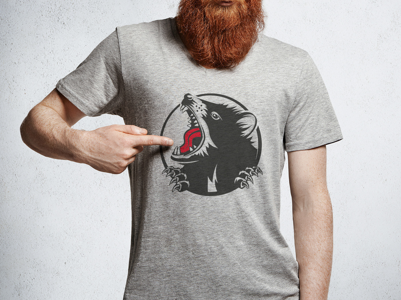
Over the last five years, Bluebonnet has proved itself in Melbourne’s thriving food scene. With the growing popularity of their American style barbecue food, they needed to find a new home and decided to step it up a notch with a new bigger venue. Taking the plunge, the team transformed a rundown old building in East Brunswick’s busy dining strip. The result is a rustic yet contemporary new space that oozes sophistication with capacity for 170 people. Inspired by this new space, the branding was created as a nod to old-school Americana. The red and blue colour palette sets the tone, the heavy use of distressing and halftone dots drives home the feeling of years gone by. The hand-drawn characters are inspired by vintage advertising and bring a real sense of fun to the brand. From business cards, menus, light-boxes and t-shirts to hand-painted signs and posters, everything was created to match the brand's raw, old school look & feel. Photos: Kate Shanasy


